


 Jan 30, 2025
 6 min read


Days Sales Outstanding (DSO) is an important cash flow metric that is often monitored by chief financial officers (CFOs) and finance departments. Days Sales Outstanding represents the average number of days it takes a company to receive payment for a sale. A high DSO number suggests that a company is experiencing delays in receiving payments. If a company is spending money faster than it is collecting it, it could be a cash flow problem. In general, it is best to reduce DSO and aim for the lowest number possible.
In my experience, CFOs and finance departments have a “feel” for what the appropriate level of DSO should be, based on historical context and experience.
How DSO is monitored and calculated
DSO is often determined monthly, quarterly, or annually. DSO is calculated by dividing total accounts receivable for a given period by total sales for the same period. This result is then multiplied by the number of days in the period (i.e., 30 days if calculated monthly, 90 days if calculated quarterly, etc.).
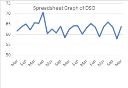
Typically, most finance departments have DSO calculated in a spreadsheet or in an automated report or dashboard. Unless the DSO for that specific period seems out of the ordinary, the analysis ends there. As you’ll see below, if you’re looking at the number or a chart created in a spreadsheet, it doesn’t provide much useful information.
Since most finance departments “monitor” the DSO for irregularities
I pulled some historical data from a real publicly traded company and looked at the quarterly reported DSO data. When I looked at the data, it had a range of 57,905 to 70,680, which means that unless the next DSO was outside of that range, it probably wouldn't raise any questions. The problem with that is (as my boss says) "you can drive a truck" in that range, so being "in the range" is basically meaningless.

Above is a typical visualization in a spreadsheet (or KPI dashboard). Can you spot a trend or an outlier?
Minitab can provide a better way to monitor and analyze
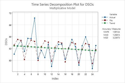
Using Minitab Statistical Software, I was able to take the exact same data set and run a time series analysis on it (using the Decomposition command to account for quarterly seasonality). In doing so, I gained two great insights: First, the time series decomposition plot highlighted a trend of improving DSO. The finance team may have been proactively implementing processes to collect faster, or they got lucky. Either way, the trend shows DSO decreasing, which is positive.
Now compare the default Minitab graph below with a typical spreadsheet graph (which has been edited, unsuccessfully, to paint a clearer picture). It’s clear that the Minitab graph highlights a trend that might not be noticeable in a spreadsheet graph.
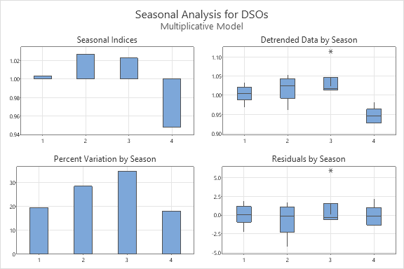
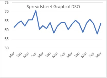
The second insight is to understand the seasonality of collections. The charts below clearly highlight that in Q4, the company collected receivables significantly faster than any other quarter. Perhaps there is something the team is doing that can be applied to the first three quarters of the year? Regardless, understanding seasonality helps recognize when DSO is trending in the wrong direction before it is too late. From a spreadsheet perspective, seasonality can also be seen, but other than a clear indication that December has the lowest DSO, there is not much information about the first three quarters.
Tell me something I don't know: How do I avoid high DSO?
A CFO might read this and challenge me that CFOs should intuitively understand seasonality and how DSO is trending. Maybe. Doing this exercise not only confirms (or clarifies) the finance department, but also helps prevent future failures.
In addition to tracking the DSO trend, your finance department should maintain a DSO control chart. Control charts, most commonly used in process monitoring, indicate when your process is out of control and corrective action is needed. There are many different types of control charts for different types of data and processes, so I used an individual chart of my seasonally adjusted data because the quarterly DSO is effectively an average over a quarter.
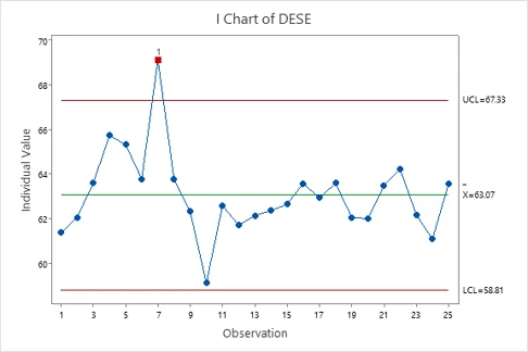
The control chart above highlights that observation point 7 (the September quarter where DSO was above 70) was “out of control.” As we see from the trend, actions were clearly taken to not only mitigate the problem, but also to make what appear to be lasting improvements.
The control chart also adds context. Initially, an upward trend signaled a problem that needed to be addressed. Interestingly, after its low point (observation 10), the company once again saw an upward trend in DSO. The control chart demonstrates that this trend was moving toward the mean, rather than signaling another risk. If anyone asks about this new, increasing negative trend (e.g., CEO, investors, CFO), the control chart is a great tool to demonstrate that there was no reason to sound the alarm.
Again, compare the control chart with one created by a spreadsheet. Which one provides more insights?
These easy analyses take less than five minutes…and can be applied to many other metrics!
Since finance teams tend to live in their financial systems and spreadsheets, there’s bound to be some statistical anxiety (which is a real thing!) holding you back. I can assure you that not only is the analysis quick and simple, it can also be set up and automated on a dashboard using Minitab Connect. It can also be applied to other key financial metrics, so you can leverage your newfound statistical knowledge.
Whether you are a startup where cash flow is critical to surviving day to day or a large enterprise with significant cash flows, catching trends and issues before they occur will certainly save you money and time.
Source: Minitab
Talk to Software.com.br and get to know better Minitab together with a specialist.